Why do Companies Redesign Logos?
Your logo is probably the first important element of your brand identity and visual story that communicates with customers. But why change something that has worked for a long while? Why shake up something that has already built a perception and been accepted? Why risk moving away from something conventional and explore something new?
Here are 5 reasons why a logo redesign might just be needed for your brand.
You need a smart rebranding!
When you want to modernize a brand without destroying its brand recognition, the smartest solution is to redesign or tweak the logo. It’s the simplest way to grab attention from customers and quickly change perception.
Even if you are an established brand or company, what worked 25 years ago might not work today. Design trends have changed. Logo designs have become sleeker, neater and simpler. So sometimes you may have to completely change or tweak your logo design just to make it more relevant and feel less outdated. You might also want your logo to now be usable and adaptable across digital media platforms. A logo redesign can help you do just that and make you look fresh and different!
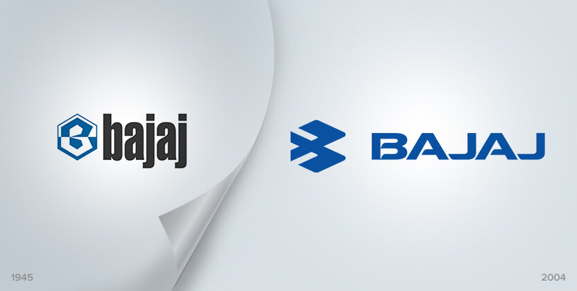
When Bajaj Auto announced that they are shifting to the fast lane with a smart, new logo after 34 years – a stylised ‘B’, it definitely grabbed attention. The white and blue reverse hexagonal symbol with Bajaj Auto in small lettering in the earlier logo was replaced by an open abstract form of stylized B or the ‘Flying B’ denoting speed.
Your product offering has changed!

When your product offerings diversify, it may have to reflect in your logo too.
Wipro has now changed its logo for the first time since 1998. The new brand identity is all about Wipro’s emergence as a trusted digital transformation partner to new clients and old. Designed around the theme of ‘connecting the dots’ the logo has four circles – where each stand for the company’s values, employees, clients/partners and communities. The logo also stands for its strong technology heritage and capabilities for the future with the expanding pattern in the design showing growth without boundaries.
You have entered into a merger!

A merger signifies new beginnings, expansion and growth. In such cases, identity of the company is often revamped to be more in sync with the new brand positioning.
When the recent merger between State Bank of India and 6 entities made SBI one of the world’s top 50 banks in the world, an identity change was anticipated. And it indeed did change.
The long word form was cut short to a simple SBI with its signature blue keyhole icon. The monogram has been refined for greater clarity and ease of use and the blue shade made brighter. The new logo has been designed to ensure consistency and recall across all touch-points. The revamped logo is more in sync with today’s generation and technology and shows SBI as a modern, tech-savvy bank which is rapidly growing digital.
You want to connect to a new Target audience!

If you play it right, your new logo will connect well to a new audience while still maintaining existing customer base. A rebranding signals that you are open for change to fit your customer needs better. It can also help you to reach a wider audience and retarget more efficiently the second time around.
When the 110 year old brand Godrej went for a makeover, it was a refreshing change. The original famous logo of Godrej was actually its founder’s signature and red in colour. It had now been changed to a vibrant maroon, green and blue, making it more contemporary and relevant. The logo color symbolizes refurbishment of the masterbrand and consolidates its presence in various business areas. The Company retained the old logo style while adding the splash of colors, to maintain continuity of brand recognition and empathy.
The revamped Godrej logo showcases the brand’s attitude as a progressive, competitive and innovative company that aims to stay in the heart of every Indian household.
You have new competition!

When you are on top of your game and suddenly face new competition, a brand revamp could make all the difference – to remind customers what makes you the brand that you are. But before you deconstruct the logo completely, consider the current design elements that represent your brand effectively. Check which elements are still relevant and can be retained. It could be specific colors or a font type or an icon.
Online marketplace Snapdeal went in for major brand identity overhaul as part of its rebranding exercise. Being a part of the country’s booming yet highly attritional Ecommerce sector, Snapdeal had tough competition to face from both Amazon and Flipkart. After a span of 6 years of educating customers on how to buy online, Snapdeal now felt it was time to focus on building the brand.
The long standing logo color palette of red and blue in Snapdeal logo was now done away with and replaced by a red vermelho color. The new logo with a new tagline “Unbox Zindagi” was built around the concept of providing superior delivery experience to consumers and aspires to make an emotional connect with customers.
Snapdeal shares that its new logo is visualized from the perspective of the happiest moment for an online buyer i.e. when she receives her ‘box’. Every box that they deliver contains not just a product but represents a new opportunity, an aspiration or the start of a journey for consumers. So their entire new brand identity right from the brand mark to its extensions, reflects the box – a representation of untold potential and possibilities.
So think it’s time to change your logo design? Reach out to us to know how we can help you.