Rebranding
Diet Food
How a revamped branding assisted the entry of an experienced brand in the F&B category from the regular mom-and-pop store to the modern retail trade
Dip Foods the brand
A baked foods products brand, Dip Brand uses 100% natural ingredients and has its proprietary baking process. This two thing ensures that their products have extremely low oil content without compromising on the taste of traditional Indian snack food, thus making them a healthier option for its consumers
The Challenge
Despite being in business since 1997, the brand struggled to make its presence felt in the market, with larger and more renowned brands with huge advertising spends hogging the show. The other key challenge was to create a unique identity for the brand amid all the competition and ensure that its products gained wider acceptance.
The Healthier Look
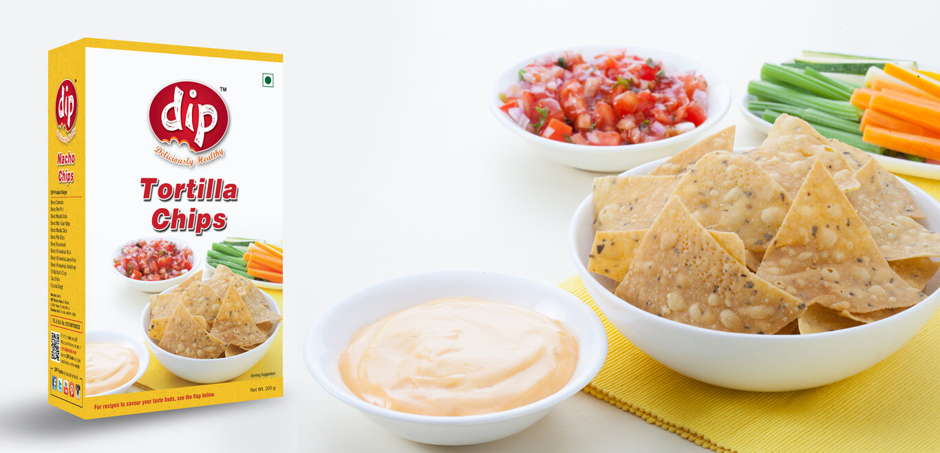
The first and foremost thing was to break the myth of consumers that healthy products are not tasty and vice versa. This was achieved by giving them a new tagline “Deliciously Healthy” that connected with regular consumers as well as health-savvy. Being a snack food, the new logo was designed using colours as well as a mnemonic in a manner that stimulated the hunger pang and tempts them to buy the product. Different packaging was designed to cater to the regular class as well as the premium class that helped them in creating a sheer distinction within their product range. Also, creative inputs were given on the product photography on the packaging to create a recall value as per the eating habits of the customers
Set the cash bells ringing
The ‘bite’ in the logo did the trick, as new avenues opened up for the once-obscure brand. With more and more retail outlets opening their doors to them and export orders coming their way, the revamp brand set the cash bell ringing for them!


